help to better help you:
Please: add always Joomla / JEM version and details to your posts, so we can try to reproduce your issue!
The Responsive JEM
Re: The Responsive JEM
8 years 6 months ago
I think we let you be disappointed. If you read the readme, you find a lot of variations. Until now it's the best.
You can vary or propose a alternative, then other users can choose what they will prefere.
For me it's the best until now!
You can vary or propose a alternative, then other users can choose what they will prefere.
For me it's the best until now!
The topic has been locked.
Re: The Responsive JEM
8 years 6 months agoIf you read the readme
So, I might missed that one. In the downloaded package there was no such read-me-file, just a text how to install.
And there it was explained to hack the width field in settings which leaves only the option "yes/no" instead of varying the layout according to the different media sizes (480, 768, 980 etc.)
Would be good to get that "read me", too.
Regards,
Herbert
Herbert
The topic has been locked.
Re: The Responsive JEM
8 years 6 months ago
Hey,
the readme is integrated into the installation file, sorry about that, eventually i should split those files.
But i do not understand you problem. The layout adopts to two different screen sizes. The Breakpoint is at "max-width: 47.938rem". On widescreen it is not "just one column" ists a table like, or the modern, more title-oriented layout. Please take a look at the example page: JEM Responsive Demo
I think I can not really understand you problem, could you please explain it with more detail, eventually with screenshots?
The following user(s) said Thank You: jojo12
The topic has been locked.
The topic has been locked.
Re: The Responsive JEM
8 years 6 months ago
I use JEM 2.2.2 on Joomla 3.8.3 and in my example screenshots I refer to the view of (JEM terminology) "category-list":
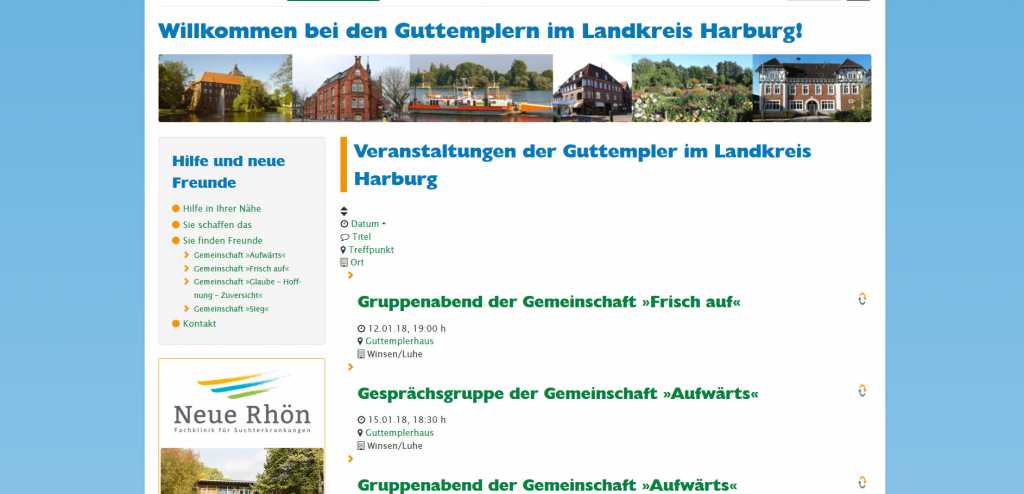
The orginal table on guttempler-winsen.de/veranstaltungen looks like this:

Not the freshest design, I agree, but still a table, using the given space optimal and paper-saving when printed.
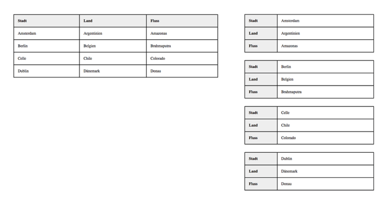
After installing JEM-Responsive and following the instructions to the letter, I get his:
I even skipped the right column, to test whether the behaviour changes in maximum width. There is a lot of blank space and while having ten events on the standard screen, the same space offers only three events now.
I think you did something as it was described here (in German language) : Restructure table with css.
Both the idea and your work are brilliant, but I prefer to have your change made only on mobiles below 480px width.
I hope I could make my point understandable.
The orginal table on guttempler-winsen.de/veranstaltungen looks like this:
Not the freshest design, I agree, but still a table, using the given space optimal and paper-saving when printed.
After installing JEM-Responsive and following the instructions to the letter, I get his:
I even skipped the right column, to test whether the behaviour changes in maximum width. There is a lot of blank space and while having ten events on the standard screen, the same space offers only three events now.
I think you did something as it was described here (in German language) : Restructure table with css.
Both the idea and your work are brilliant, but I prefer to have your change made only on mobiles below 480px width.
I hope I could make my point understandable.
Regards,
Herbert
Herbert
The topic has been locked.
Re: The Responsive JEM
8 years 6 months ago - 8 years 6 months ago
Hey,
your second screenshot loos like the jem.css is not interpreted correctly, what browser(-version) do you use?
If it would be correct, but your screen is very small, minimum the first line, where you sort by date, name etc should be horizontal (e.g. 2 items per line) because the items are very small in this line.
Another hint is that the list items are not shown as "list item". In the jem.css each list item is a rectangle with borders and has a mouse-over effekt
Please make shure the user has access to your templates jem.css file.
Path: /<site-root>/templates/<your template name>/css/com_jem/jem.css
Eventually you have to change user rights via ftp?
Last edit: 8 years 6 months ago by Egnarts.
The following user(s) said Thank You: HerKle
The topic has been locked.
Time to create page: 3.806 seconds